 Dodgers Digest Los Angeles Dodgers Baseball Blog
Earlier today, the Dodgers announced that they’d be wearing alternate road jerseys with “Dodgers” spelled out rather than the usual “Los Angeles” for a handful of games. The official site relays the history of the jersey:
When the team moved to California in 1958, their road uniforms read “Dodgers” but were changed the following season to “Los Angeles” and remained that way until 1969. The team name returned from 1970-98, but the club has worn road uniforms with “Los Angeles” since then.
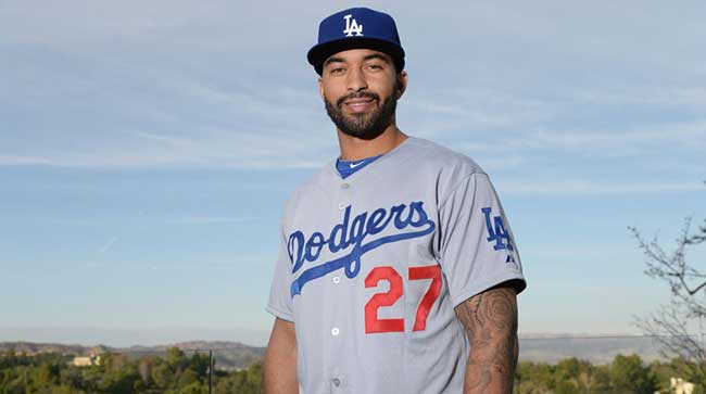
So they’ve gone back and forth between “Los Angeles” and “Dodgers” a few times, and frankly it doesn’t really matter much to me which it is. They’re both fine, they’ve both been used, and to be honest, had I seen that picture of Matt Kemp above without the accompanying story, I probably wouldn’t even have noticed that his jersey said the team name rather than the city name.
That’s fine, but I guess it’s also sort of the issue, because it’s also something no one’s really going to notice, and so… why bother? I know that Lon Rosen followed with a quote about “iconic brand names” and all that, but that doesn’t resonate with the fans. It seems to me that if you’re going to have an alternate jersey, then have a true alternate jersey, not something that will be barely recognized and probably ignored.
That, I know, opens up an entirely different can of worms, which is that a large contingent of Dodger fans hate the idea of them ever having a true solid blue alternate jersey. I get that, I do. They’re proud of the Dodgers being one of just three teams (along with the Tigers and Yankees) who wear only white and gray, and I respect that opinion. I absolutely would not want the Dodgers to turn into one of those teams — thinking here about the Marlins in black — who wear their alternates so often that it’s a rare treat to actually see a white or gray uniform.
 But… Dodger blue is great, isn’t it? Is it so bad to want to see more of it? Not every night, for sure, but in a long 162 game season, is breaking out blue for Sunday home games or day games or something similar the worst idea in the world?
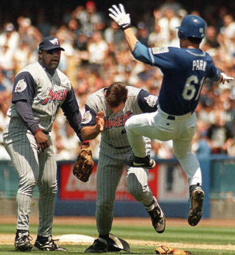
Chan Ho Park was wearing blue in the iconic “I’m going to dropkick Tim Belcher” game back in 1999, and you know what: that’s a good, clean look. (Fine, it probably doesn’t hurt that it’s being modeled against those ludicrous 1990s Disney-fried pinstriped vest debacles the Angels had on, and Mo Vaughn doesn’t really make anything look better. But still.)
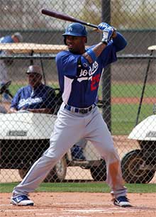 It works for gray pants, too, as this picture of Carl Crawford that I grabbed from Dustin shows. Obviously, you’d want to lose the silly white side panel and have it be fully blue, but again, another solid look. Maybe you prefer it say “LA” in white rather than “Dodgers,” but whatever. If you’re going to have an alternate, have an alternate.
On the other hand, having two jerseys that look so similar does open up the possibilities for hilarity, as we’ve seen more than a few times in the past. Look no further than Chris Colabello wearing a dark blue “Twins” jersey last year while his teammates were all wearing dark blue “Minnesota” uniforms… or the same thing happening with the Astros in 2011… or old friend Chris Capuano wearing the wrong dark blue jersey for Milwaukee in 2010… or half a dozen other examples.
I don’t really think a blue alternate Dodger jersey is ever going to happen on a permanent basis, and that’s fine. I just don’t really get the point of this, either. The Dodgers are no longer one of the teams who don’t have an alternate… except they still don’t really have an alternate.